“You know… that foot thingy down the bottom.”
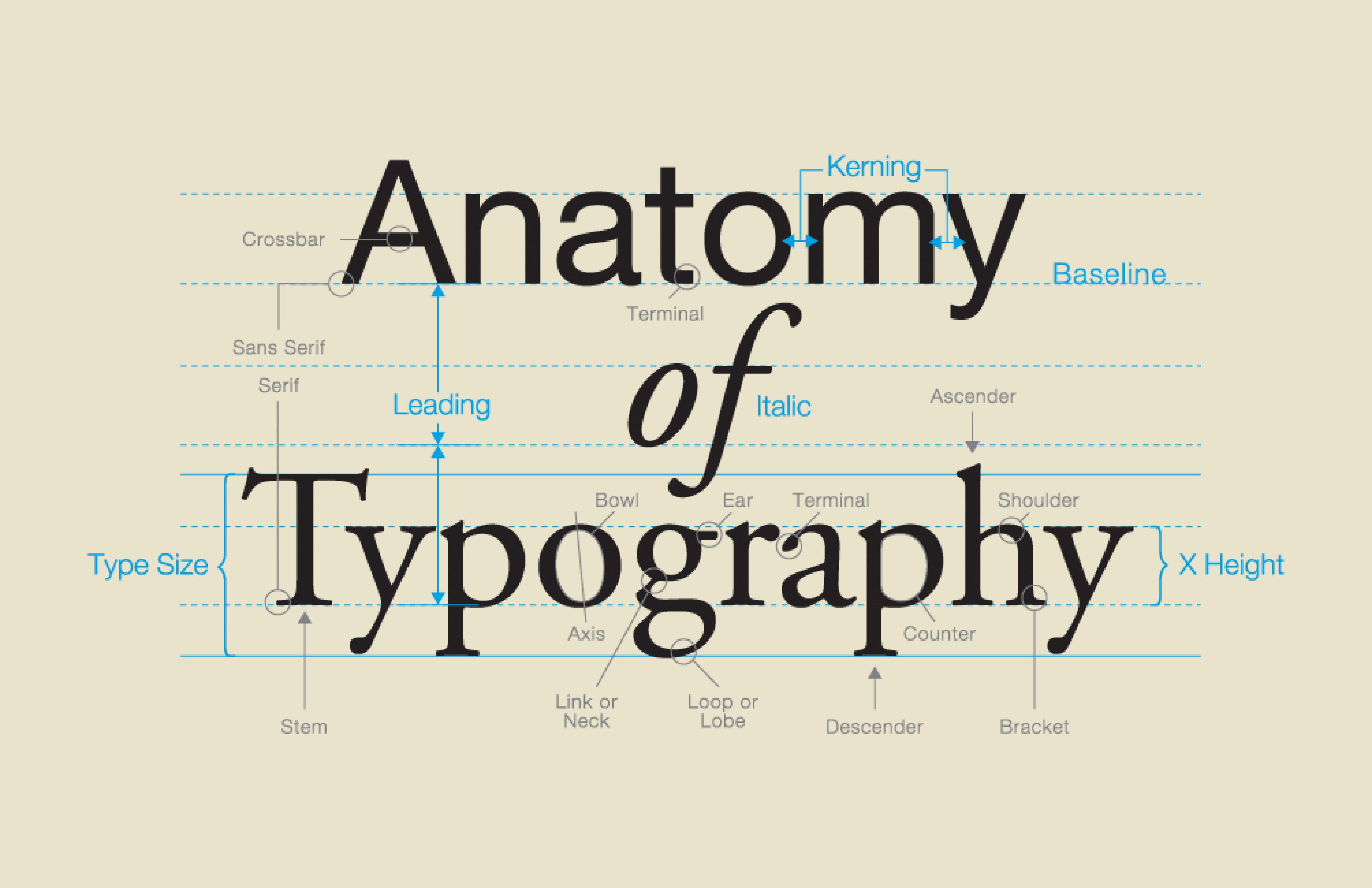
Working with an observant client today on their likes and dislikes of the curvatures of stems and serifs on different typefaces — and I must admit I had to give myself a refresher course on the proper anatomical terminology of letterforms so that I could explain to them what we were looking at.
I thought I would share two illustrations and a good article on the proper terms and parts of letter forms so you can communicate effectively the next time your client says, “you know… that foot thingy at the bottom.”
Enjoy.
First a simple one — and good article — from loveofgraphics.com.

And a more comprehensive description of most things type.