Just Because YOU Love A Design, Doesn’t Mean Your Client Will!
Even though your design looks great…. maybe it’s not the the right solution to the problem… maybe the client doesn’t share your vision… or maybe the project gets scrapped before it ever gets off the ground! Uggggg.
Well… you still love them, and you still own them… so why not show them off! So here goes, my favorite logo designs of 2014 that didn’t make it to the show.
1. Inspect My Boat
![]()
Love, it! Simple straight forward an instantly recognizable icon for inspectmyboat.com.
I thought I nailed it right off the bat — I actually presented this to the client the moment I finished it which is something I never do — that’s how confident I was in the design.
The client loved it too, but unfortunately went missing and we never reconnected on the project. Seems odd, but this happens from time to time. It’s a shame too, I would have loved to have finished this project.
2. Sunwire
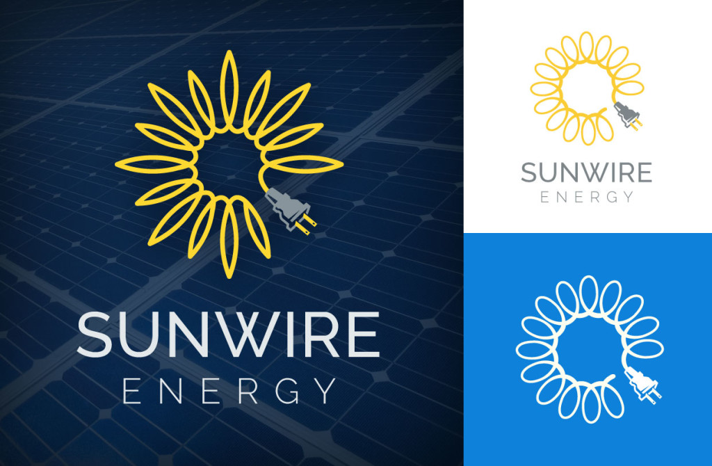
Another “sure-to-be-winner” first-concept for a solar energy company. Again, simple and fun… Ok, maybe it doesn’t scream SUN, but it certainly works well with the word SUNWIRE underneath and the intended tagline of “plug into the sun”. Either way, I loved the way this turned out, and was bummed to see that it just wasn’t right for the client — it was a bit too playful and “plug” focused and therefore it didn’t reflect the corporate and government client base.
3. Sunwire Take Two
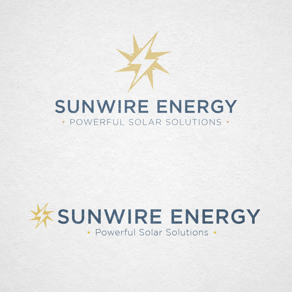
Powerful, strong, corporate and maybe even a tad military-like… and with a new tagline. I loved the way this power symbol, turned sun icon, came out— but alas, the client didn’t.
4. Venture Society
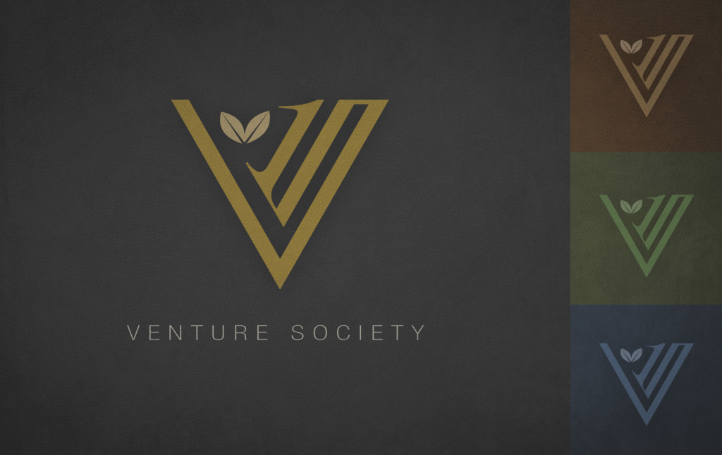
File this one in the “dead-before-it-hit-the-ground” category — this mark for an exclusive venture capital organization never materialized.
Bummer. I loved the way the V and the S and the numeral 1 come together to make a classic, yet modern-looking shape — representing the idea of “first to the table” and “growth”. Works well on reversed or on solid background.
5. Business In A Box

I usually favor the simplistic flat designs over the 3 dimensional rendered illustrations, but on this design for a business in a box concept I went for it and thought it turned out great. With the inclusion of assets, ideas, reports an integrated corporate mark… and works great in a square lock-up… it’s got it all, but you guessed it… NO DICE!
6. Weiss PR Strategy
![]()
Ok, Ok, the fact that the client didn’t choose this one actually turned out for the best — the final Weiss PR logo that I did turned out even better and represented the company in a much more obvious and professional way, BUT… I still LOVE this logo.
To me it says strategy, team work and guidance, while still making a pretty good W shape. Plus, I love the fact that this was one of the my logos that started off as a hand-drawn idea. I always start with paper and pencil, but don’t always take it very far on paper before running home to mama-Mac — this one was an exception.

7. Accurate Copywriting
 This concept is actually pretty darn close to the final logo that the client and I settled on, but I thought this earlier version just had more personality.
The Fed-Ex-like hidden arrow, the double C and the bullet in the E creates a trifecta of logo magic… then add in the A as a gun and the bullet hole — which would have been die-cut into the business cards, btw. — works on so many levels for the shooting sports industry.
One of my favorite logos I’ve done, period.
So there you have it…
Or don’t have it! Which ever way you look at it.
Sometimes I’m just as proud of the work that doesn’t get published, as I am of the work that does, and I’m thankful to have been able to scratch my head on so many cool projects this year.
To see some of the ones that did make it, click here »
Looking forward to what 2015 has in store. Keep’m coming!